ABOUT THIS PROJECT
What was your involvement on this project?
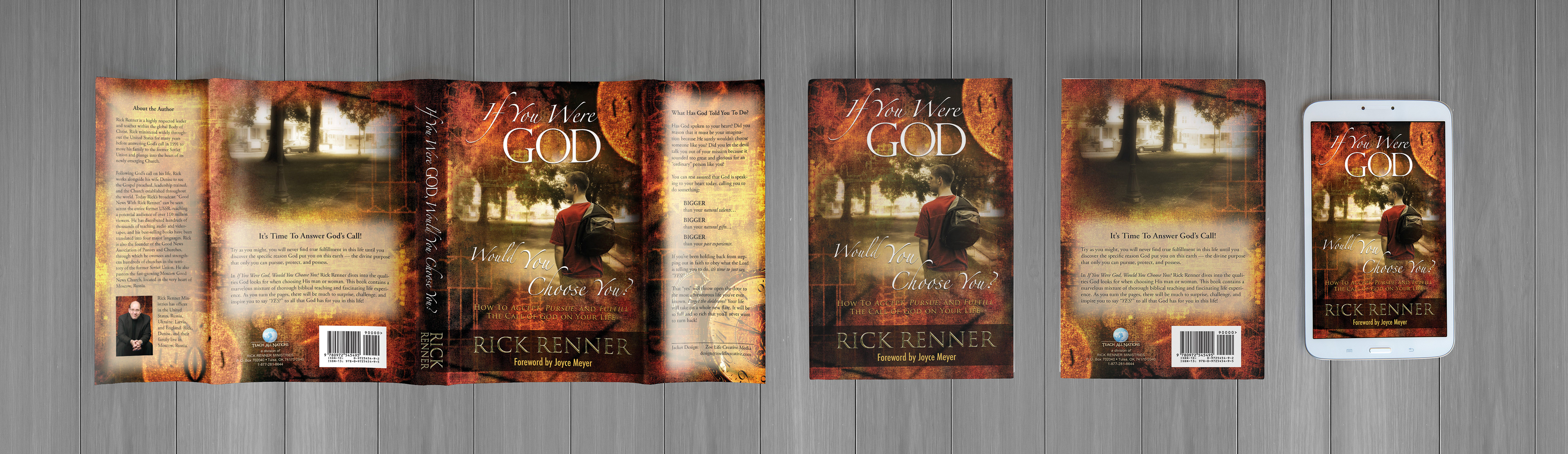
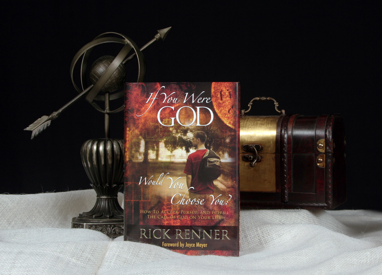
I designed the dust jacket artwork of this book and delivered press files to the printer. I did not typeset the interior.
What was most interesting part of this project?
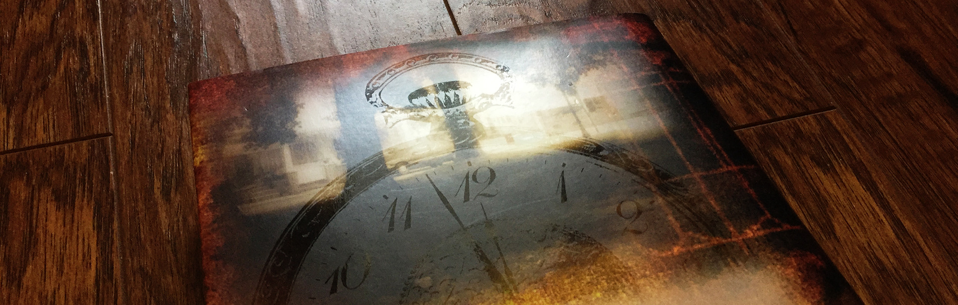
The embossing and spot varnish artwork. The title (front cover and spine) received an emboss when printed. But my favorite part of this book is on the back cover, where I superimposed the image of a pocket watch in glossy varnish. The effect is only visible when the book is tilted. This imagery of "time" reinforced the back cover message, "It's Time To Answer God's Call!"
What was most challenging about this project?
The title. The author was trying to convey that precisely because we are so familiar with our own shortcomings, "if we were God" we likely would not choose ourselves to certain positions or assignments.
Although relatable, the title suggests answering "no, I would not choose me." In marketing, little no's can result in other no's (like not buying the book).
To offset this subconscious conversation, I pulled on vibrant and nostalgic colors. I also chose an unassuming youth to play the role of our unlikely "choice" — reminding readers that God does not look on the outward appearance, He looks on the heart.
Above: Behind the Book video created by Zoe Life Creative Media © 2012